Brand & Product Design Studio

Bring your brand into frame.

Brand identity, websites, and marketing — designed to take growing brands to their next stage.

Services

A full toolkit for your brand's next stage.

Brand Identity & Strategy

Logos, visual systems, positioning, and the story that ties it together — so your brand looks and sounds the part.

  • Logo & visual identity
  • Brand guidelines
  • Positioning & messaging

Web & Product Design

Websites and product UX, from research to responsive build.

  • Websites & landing pages
  • Product UX & UI design
  • Responsive build & handoff

Marketing & Content

Campaigns, social, and content across every touchpoint.

  • Campaigns & social
  • Content & copywriting
  • Email & collateral

Brand Growth & Consulting

A clear roadmap to scale — turning where you are today into where you want your brand to go.

  • Positioning & roadmap
  • Brand audits
  • Ongoing consulting
Work

Selected projects.

View all work
Hmong Cultural Center

Hmong Cultural Center

Responsive Redesign UX Research
Park n Go

Park n Go

App Design UX Research
Wellness in the Woods

Wellness in the Woods

Brand Marketing Web
HelloSpoke

HelloSpoke

Rebrand Website
Graham Ivy
About

Hey, I'm Graham.

Open Frame is my studio. I take brands from A to Z — turning ideas into designs that connect people, culture, and commerce.

From identity to interface, I help growing brands become remarkable: strategic, human, and built to grow.

Ready to bring your brand into frame?

A project in mind? Start one — or grab a free 30-minute call and let's talk it through.

Work

Selected work.

Brand, product, and marketing projects — taking people and organizations to their next stage. Hover to peek; two are full case studies.

Hmong Cultural Center

Hmong Cultural Center

Responsive Redesign UX Research
Park n Go

Park n Go

App Design UX Research
Wellness in the Woods

Wellness in the Woods

Brand Marketing Web
HelloSpoke

HelloSpoke

Rebrand Website
Needlework Guild of MN

Needlework Guild of MN

Identity Web

Like what you see?

I'm open to freelance, collaboration, and full-time roles. Let's talk about your next project.

Start a project
About

Hey, I'm Graham.

I'm a designer and brand consultant in Minneapolis. Through my studio, Open Frame, I help people, growing organizations, startups, and nonprofits turn ideas into brands people remember — from identity and messaging to websites and the marketing that grows them. Off the clock, I'm usually scuba diving, salsa dancing, or deep in some amateur paleontology.

Graham Ivy
Principles

How I approach the work.

Human-Centered

Empathy, inclusion, and real-world context guide every design decision I make.

Creatively Focused

I bring imagination and clarity to problem-solving — thoughtful, engaging ways to meet user and business goals.

Data-Driven

Grounded in user research, testing, and analytics — so solutions aren't just creative, but effective.

Always Evolving

I embrace feedback, iterate often, and stay curious — because great design is never finished.

Career

Where I've worked.

2023 — Present

Wellness in the Woods

Communications Assistant · Visual Designer · Content Strategist

Leading the organization's visual and written voice across campaigns, social, marketing, and web.

Freelance

HelloSpoke

Brand & Web Designer

A full rebrand and website rebuild — refreshing the brand identity and delivering a modern, on-brand site.

2022

Selina

Community Experience Designer

Designed touchpoints that brought a global hospitality community together.

2020 — 2023

SOTA Extracts Inc

Web Designer

Owned web design and visual assets for the brand from concept to launch.

2016 — 2020

Gustavus Adolphus College

Student Experience Designer

Created student-facing experiences and visual communications on campus.

Ready to bring your brand into frame?

A project in mind? Start one — or grab a free 30-minute call and let's talk it through.

Contact

Tell me what you're building.

Say hello

Have an idea, a role, or a project?

Tell me a little about it and I'll get back to you within a day or two.

hello@openframeconsulting.com

Schedule a free 30-minute call.

Have a project in mind? Grab a 30-minute video call and we'll talk through what you're building — no pressure, no pitch.

Book a time
Services

How I can help.

Four ways I help growing brands move forward. Pick a starting point, or book a call and we'll find the right one together.

Brand Identity & Strategy

Logos, visual systems, positioning, and the story that ties it together — so your brand looks and sounds the part.

  • Logo & visual identity
  • Brand guidelines
  • Positioning & messaging

Web & Product Design

Websites and product UX, from research to responsive build.

  • Websites & landing pages
  • Product UX & UI design
  • Responsive build & handoff

Marketing & Content

Campaigns, social, and content across every touchpoint.

  • Campaigns & social
  • Content & copywriting
  • Email & collateral

Brand Growth & Consulting

A clear roadmap to scale — turning where you are today into where you want your brand to go.

  • Positioning & roadmap
  • Brand audits
  • Ongoing consulting
Work

Selected projects.

View all work
Hmong Cultural Center

Hmong Cultural Center

Responsive Redesign
Park n Go

Park n Go

App Design · UX
Wellness in the Woods

Wellness in the Woods

Brand · Marketing · Web
HelloSpoke

HelloSpoke

Rebrand · Website

Ready to bring your brand into frame?

A project in mind? Start one — or grab a free 30-minute call and let's talk it through.

Brand Identity & Strategy

Look like the brand you already are.

Positioning, identity, and the story that makes a brand unmistakably itself. From strategy and naming to logo, type, and a full visual system, I build brands that look sharp and hold up everywhere they show up.

Start a project
Brand Identity & Strategy
The process

How we'll work together.

01

Hello & intro call

Send a note about your goals, then we hop on a free 30-minute call to align on scope, timeline, and fit.

02

Proposal & kickoff

I send a clear proposal and a flat-rate quote. A 50% deposit kicks us off and we gather content and branding together.

03

Draft & revisions

We start with a rough draft and refine it in clear rounds — the fun, back-and-forth part.

04

Launch & beyond

Final polish, set-up, and go live. Retainer or hourly support whenever you need it after.

Selected work

Projects in this space.

View all work
HelloSpoke

HelloSpoke

Rebrand · Website
Wellness in the Woods

Wellness in the Woods

Brand · Marketing · Web
Needlework Guild of MN

Needlework Guild of MN

Identity · Web
FAQs

Here's what I can answer for you.

Still have a question? Let's talk.

Growing brands, nonprofits, startups, and individuals — mostly small teams who want senior design without big-agency overhead.

Yes. I'm based in Minneapolis and work with clients anywhere, over calls and shared files.

Absolutely — from strategy and identity through to a designed, built, and launched result. A to Z.

Collaborative and transparent: we agree on scope, work in clear phases with regular reviews, and you're involved the whole way through.

Book a free 30-minute intro call. We'll talk goals and fit, then I'll send a proposal scoped to your project.

Services

Looking for something else?

Web & Product Design

Websites and product UX, from research to responsive build.

  • Websites & landing pages
  • Product UX & UI design
  • Responsive build & handoff

Marketing & Content

Campaigns, social, and content across every touchpoint.

  • Campaigns & social
  • Content & copywriting
  • Email & collateral

Brand Growth & Consulting

A clear roadmap to scale — turning where you are today into where you want your brand to go.

  • Positioning & roadmap
  • Brand audits
  • Ongoing consulting

Ready to bring your brand into frame?

A project in mind? Start one — or grab a free 30-minute call and let's talk it through.

Web & Product Design

A site that works as well as it looks.

Websites and product experiences that are clear, fast, and built to convert. From research and wireframes to a polished, responsive build, I design sites that feel effortless to use and easy to grow with you.

Start a project
Web & Product Design
The process

How we'll work together.

01

Hello & intro call

Send a note about your goals, then we hop on a free 30-minute call to align on scope, timeline, and fit.

02

Proposal & kickoff

I send a clear proposal and a flat-rate quote. A 50% deposit kicks us off and we gather content and branding together.

03

Draft & revisions

We start with a rough draft and refine it in clear rounds — the fun, back-and-forth part.

04

Launch & beyond

Final polish, set-up, and go live. Retainer or hourly support whenever you need it after.

Selected work

Projects in this space.

View all work
Park n Go

Park n Go

App Design · UX
Hmong Cultural Center

Hmong Cultural Center

Responsive Redesign
HelloSpoke

HelloSpoke

Rebrand · Website
Needlework Guild of MN

Needlework Guild of MN

Identity · Web
FAQs

Here's what I can answer for you.

Still have a question? Let's talk.

Growing brands, nonprofits, startups, and individuals — mostly small teams who want senior design without big-agency overhead.

Yes. I'm based in Minneapolis and work with clients anywhere, over calls and shared files.

Absolutely — from strategy and identity through to a designed, built, and launched result. A to Z.

Collaborative and transparent: we agree on scope, work in clear phases with regular reviews, and you're involved the whole way through.

Book a free 30-minute intro call. We'll talk goals and fit, then I'll send a proposal scoped to your project.

Services

Looking for something else?

Brand Identity & Strategy

Logos, visual systems, positioning, and the story that ties it together — so your brand looks and sounds the part.

  • Logo & visual identity
  • Brand guidelines
  • Positioning & messaging

Marketing & Content

Campaigns, social, and content across every touchpoint.

  • Campaigns & social
  • Content & copywriting
  • Email & collateral

Brand Growth & Consulting

A clear roadmap to scale — turning where you are today into where you want your brand to go.

  • Positioning & roadmap
  • Brand audits
  • Ongoing consulting

Ready to bring your brand into frame?

A project in mind? Start one — or grab a free 30-minute call and let's talk it through.

Marketing & Content

Show up where it counts.

Campaigns and content systems that grow reach and keep a brand consistent. From strategy and social to copywriting and collateral, I make sure every touchpoint pulls in the same direction and sounds like you.

Start a project
Marketing & Content
The process

How we'll work together.

01

Hello & intro call

Send a note about your goals, then we hop on a free 30-minute call to align on scope, timeline, and fit.

02

Proposal & kickoff

I send a clear proposal and a flat-rate quote. A 50% deposit kicks us off and we gather content and branding together.

03

Draft & revisions

We start with a rough draft and refine it in clear rounds — the fun, back-and-forth part.

04

Launch & beyond

Final polish, set-up, and go live. Retainer or hourly support whenever you need it after.

Selected work

Projects in this space.

View all work
Wellness in the Woods

Wellness in the Woods

Brand · Marketing · Web
Needlework Guild of MN

Needlework Guild of MN

Identity · Web
FAQs

Here's what I can answer for you.

Still have a question? Let's talk.

Growing brands, nonprofits, startups, and individuals — mostly small teams who want senior design without big-agency overhead.

Yes. I'm based in Minneapolis and work with clients anywhere, over calls and shared files.

Absolutely — from strategy and identity through to a designed, built, and launched result. A to Z.

Collaborative and transparent: we agree on scope, work in clear phases with regular reviews, and you're involved the whole way through.

Book a free 30-minute intro call. We'll talk goals and fit, then I'll send a proposal scoped to your project.

Services

Looking for something else?

Brand Identity & Strategy

Logos, visual systems, positioning, and the story that ties it together — so your brand looks and sounds the part.

  • Logo & visual identity
  • Brand guidelines
  • Positioning & messaging

Web & Product Design

Websites and product UX, from research to responsive build.

  • Websites & landing pages
  • Product UX & UI design
  • Responsive build & handoff

Brand Growth & Consulting

A clear roadmap to scale — turning where you are today into where you want your brand to go.

  • Positioning & roadmap
  • Brand audits
  • Ongoing consulting

Ready to bring your brand into frame?

A project in mind? Start one — or grab a free 30-minute call and let's talk it through.

Brand Growth & Consulting

A steady partner as you grow.

An ongoing design partner as you scale. Audits, roadmaps, and steady senior support — the strategic guidance of a design lead, without the cost of a full-time hire.

Start a project
Brand Growth & Consulting
The process

How we'll work together.

01

Hello & intro call

Send a note about your goals, then we hop on a free 30-minute call to align on scope, timeline, and fit.

02

Proposal & kickoff

I send a clear proposal and a flat-rate quote. A 50% deposit kicks us off and we gather content and branding together.

03

Draft & revisions

We start with a rough draft and refine it in clear rounds — the fun, back-and-forth part.

04

Launch & beyond

Final polish, set-up, and go live. Retainer or hourly support whenever you need it after.

Selected work

Projects in this space.

View all work
Wellness in the Woods

Wellness in the Woods

Brand · Marketing · Web
HelloSpoke

HelloSpoke

Rebrand · Website
FAQs

Here's what I can answer for you.

Still have a question? Let's talk.

Growing brands, nonprofits, startups, and individuals — mostly small teams who want senior design without big-agency overhead.

Yes. I'm based in Minneapolis and work with clients anywhere, over calls and shared files.

Absolutely — from strategy and identity through to a designed, built, and launched result. A to Z.

Collaborative and transparent: we agree on scope, work in clear phases with regular reviews, and you're involved the whole way through.

Book a free 30-minute intro call. We'll talk goals and fit, then I'll send a proposal scoped to your project.

Services

Looking for something else?

Brand Identity & Strategy

Logos, visual systems, positioning, and the story that ties it together — so your brand looks and sounds the part.

  • Logo & visual identity
  • Brand guidelines
  • Positioning & messaging

Web & Product Design

Websites and product UX, from research to responsive build.

  • Websites & landing pages
  • Product UX & UI design
  • Responsive build & handoff

Marketing & Content

Campaigns, social, and content across every touchpoint.

  • Campaigns & social
  • Content & copywriting
  • Email & collateral

Ready to bring your brand into frame?

A project in mind? Start one — or grab a free 30-minute call and let's talk it through.

All work App Design · UX Research

Park n Go

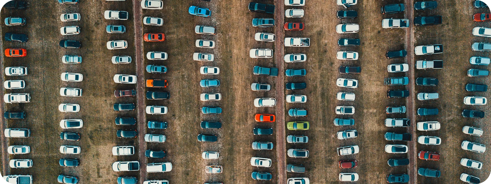
Reimagining the event parking experience — a mobile app that lets event-goers reserve their spot in advance, before the stress ever starts.

Park n Go hero

Scope

UX/UI, User Testing, Interviews, Research

Role

Sole prototyper · research, testing & visual identity

Tools

Figma, FigJam, Zeplin, Miro, VS Code, Adobe CS

Timeline

3-week sprint · design-to-dev handoff

Background

Parking is the one part of a night out no one plans for.

Venue parking is an often-overlooked yet crucial part of the concert and live-event experience. Attendees prepare for every other part of a show — except where they're going to park — which turns arrival into something stressful and confusing.

How might we take the most stressful part of attending an event and make it feel effortless?

Context
Approach

The Double Diamond.

My team worked through four phases — Discover, Define, Develop, Deliver — moving from a wide-open problem space to a focused, shippable solution.

Double Diamond process

Phase 01

Discover

Where we started

We set out to make everyday parking easier.

We began with a broad mission — simplify everyday parking. To pressure-test it, we sent out a survey and ran four in-depth user interviews.

The pivot

Then we noticed something.

A majority of survey responses — and all four interviews — pointed to the same pain point: parking for events and concerts specifically. As a team we asked ourselves: stick to the plan, or follow the signal? The insight was too strong to ignore.

User insights

Affinity mapping — top insights

100%struggle to find parking at an event
78%say time matters most when parking
66%spend 10–20 min hunting for a spot
66%have skipped an event over parking
78%would pay to reserve in advance

Market research

A competitive analysis of the top three apps our interviewees already used showed that none of them solved event parking directly. The plan changed.

Competitive analysis
Competitive analysis — a clear gap in the market.

Phase 02

Define

Redefined problem

Locating parking at venues during events and concerts.

Venue parking is the part of the live-event experience attendees are least able to plan for — the goal became clear.

The problem

The goal

Enhance the event parking experience by creating a platform that lets users reserve parking spots in advance — reducing the stress and uncertainty of finding a spot, and making the whole night smoother and more enjoyable.

User journey

Every stage, every emotion.

From the redefined goal, I built a user-journey map to illustrate each stage — from searching for parking to securing a spot — and the emotions felt throughout.

User journey map
Guiding questions

Phase 03

Develop

Idea brainstorming

What could we do differently?

Collaborative sessions turned user pain points and competitive gaps into ideas, evaluated on feasibility, user impact, and alignment with our goal. We focused on three main areas of improvement.

Idea brainstorming

Paper wireframes

Visualizing the concept, fast.

As the sole designer, I sketched paper wireframes to iterate quickly on layout and flow, then built a clickable prototype to gather early feedback before higher fidelity.

Paper wireframes

A/B testing

Refining how you pick a spot.

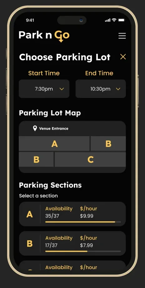
Option A used a detailed map of individual spots; Option B divided lots into simple, modular sections with pricing and availability. Users clearly preferred Option B for its simplicity — a choice that also let us ship an MVP faster.

A/B testing
Mid-fidelity wireframes
Mid-fidelity wireframes, built in a tight two-day turnaround.

UI design kit

Accessible, modern, full of movement.

We curated a high-contrast palette meeting AAA compliance, with colors and a logo inspired by street aesthetics to reflect dynamic movement — clean, crisp, and modern throughout.

UI design kit

Phase 04

Deliver

Park n Go: seamless event parking.

With branding finalized and screens user-tested, I moved into high fidelity. A component-driven Figma process made the jump from mid- to high-fidelity seamless — and produced the final product.

Final design

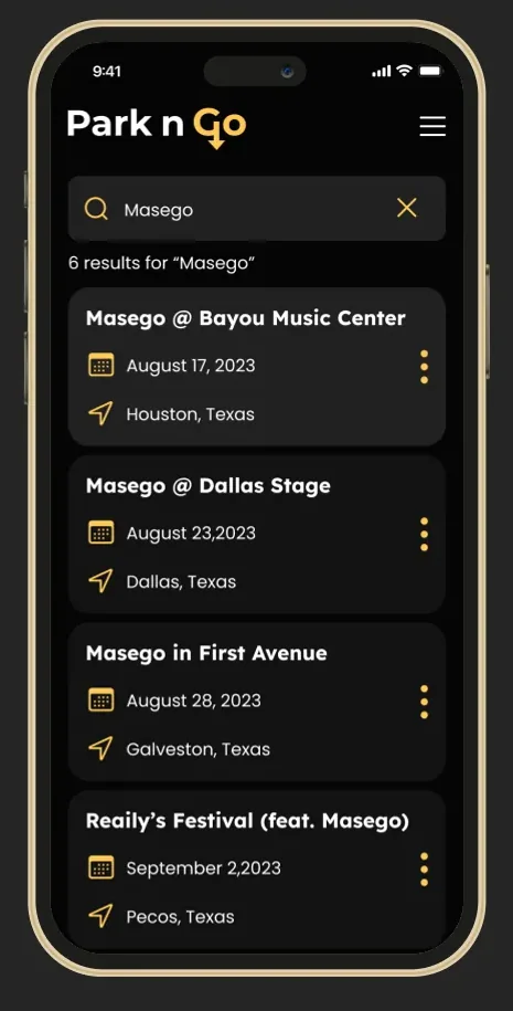
Feature 01 — Venue search

Users quickly find their event with full details, exact location, and the specific parking options tied to that venue.

Venue search

Feature 02 — Booking your spot

Preview the parking map, check availability, add driving details, and complete the purchase — all in a few taps.

Reserving a spot

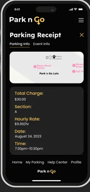
Feature 03 — Reservation receipt

Every booking lives in "My Parking," with upcoming and past reservations, full event and parking details, and the option to cancel — a complete, user-friendly management system.

Reservation receipt
Other screens
A vibrant, cohesive brand carried consistently across the app.

Future developments

There's always room for improvement.

We were thrilled with what we shipped in three weeks — research to prototyping to dev handoff — but there's more we envisioned. These are some of the future features I explored.

Future developments
Reflections

Owning the design-to-dev handoff.

I built a comprehensive PDF guide with development notes, component types, and usage — ensured pixel-perfection in organized layers, and exported every asset with precise naming. That preparation let developers integrate real-time availability, reservations, and receipts efficiently.

Practice makes perfect.

I consistently sought feedback through formal design reviews and presentations. Pitching my work, guiding conversations, and learning when to push back on feedback grew my ability to communicate clearly, remove blockers, and balance deadlines.
Hmong Cultural Center
Next case study
Hmong Cultural Center
All work Responsive Redesign

Hmong Cultural Center

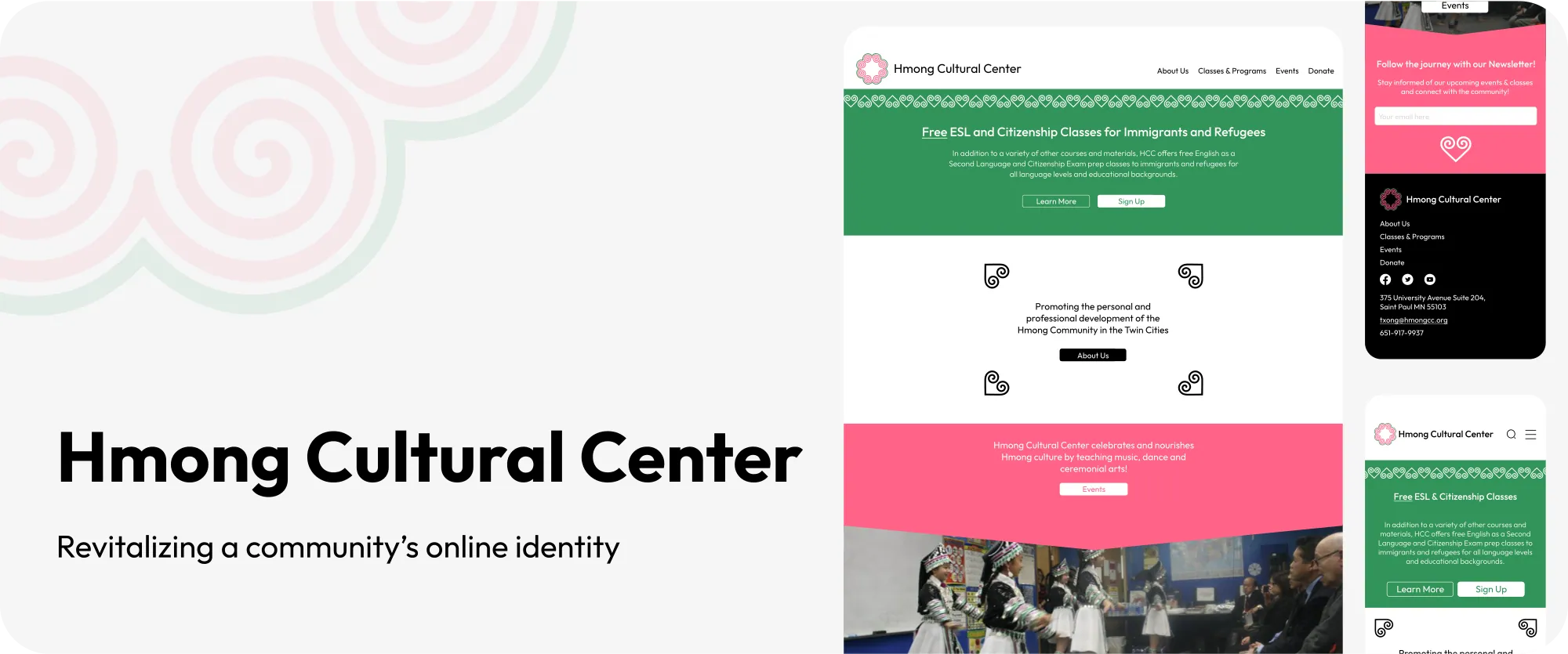
Revitalizing a community's online identity — a responsive redesign for a Saint Paul cultural hub, built around accessibility, belonging, and a clear path to resources.
Hmong Cultural Center hero

Scope

Discovery, Strategy & Design

Role

Sole prototyper · research, testing & visual identity

Tools

Figma, FigJam, Miro, Trello, Otter.ai, Adobe CS

Timeline

3-week bootcamp · mobile & desktop

Overview

Designing for a real community hub.

During a three-week UX design bootcamp, my team partnered with the Hmong Cultural Center in Saint Paul, Minnesota — a pivotal community hub offering everything from traditional embroidery to citizenship courses. Our mission was to redesign their website and strengthen its digital presence for the community.
We set out to revitalize the center's branding, streamline its information architecture, and build a compelling visual identity — ultimately improving access to resources, fostering engagement, and deepening the connection between the center and the people it serves.

My role

I served as the sole prototyper while also leading user research, interviews, testing, finalizing the design screens, and developing the visual identity.

Project overview
Scope

1 · Discovery

  • Conduct stakeholder interviews
  • Perform user surveys and interviews
  • Analyze similar cultural-center websites
  • Review existing website content

2 · Strategy

  • Develop updated branding guidelines
  • Create a new site map and navigation structure
  • Develop user personas
  • Map out user journeys

3 · Design

  • Develop low-fidelity wireframes
  • Create high-fidelity prototypes
  • Conduct usability tests
  • Ensure responsive design
Approach

The Double Diamond.

We worked through four phases — Discover, Define, Develop, Deliver — exploring the problem space, synthesizing findings into a focused brief, prototyping solutions, then refining and implementing a design that meets both user needs and the center's goals.

Double Diamond process

Phase 01

Discover

What's already there?

Auditing the current site.

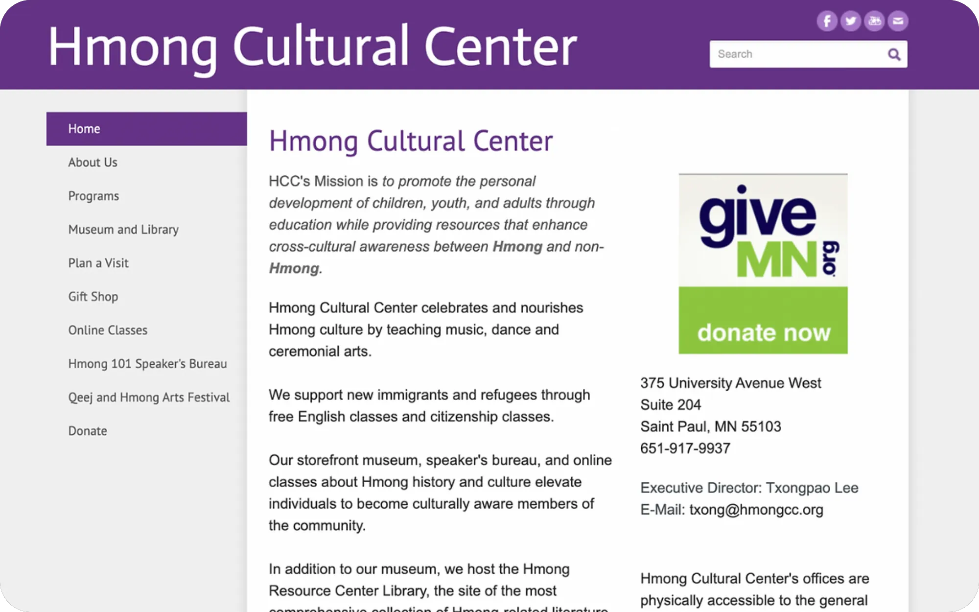
We began by reviewing the current HCC website and running a heuristic analysis of its functionality, aesthetics, and accessibility. Because the center is unique in its area, we analyzed sites serving similar markets and goals rather than direct competitors.

Heuristic analysis of the original site
Heuristic analysis of the original site.

Listening to users

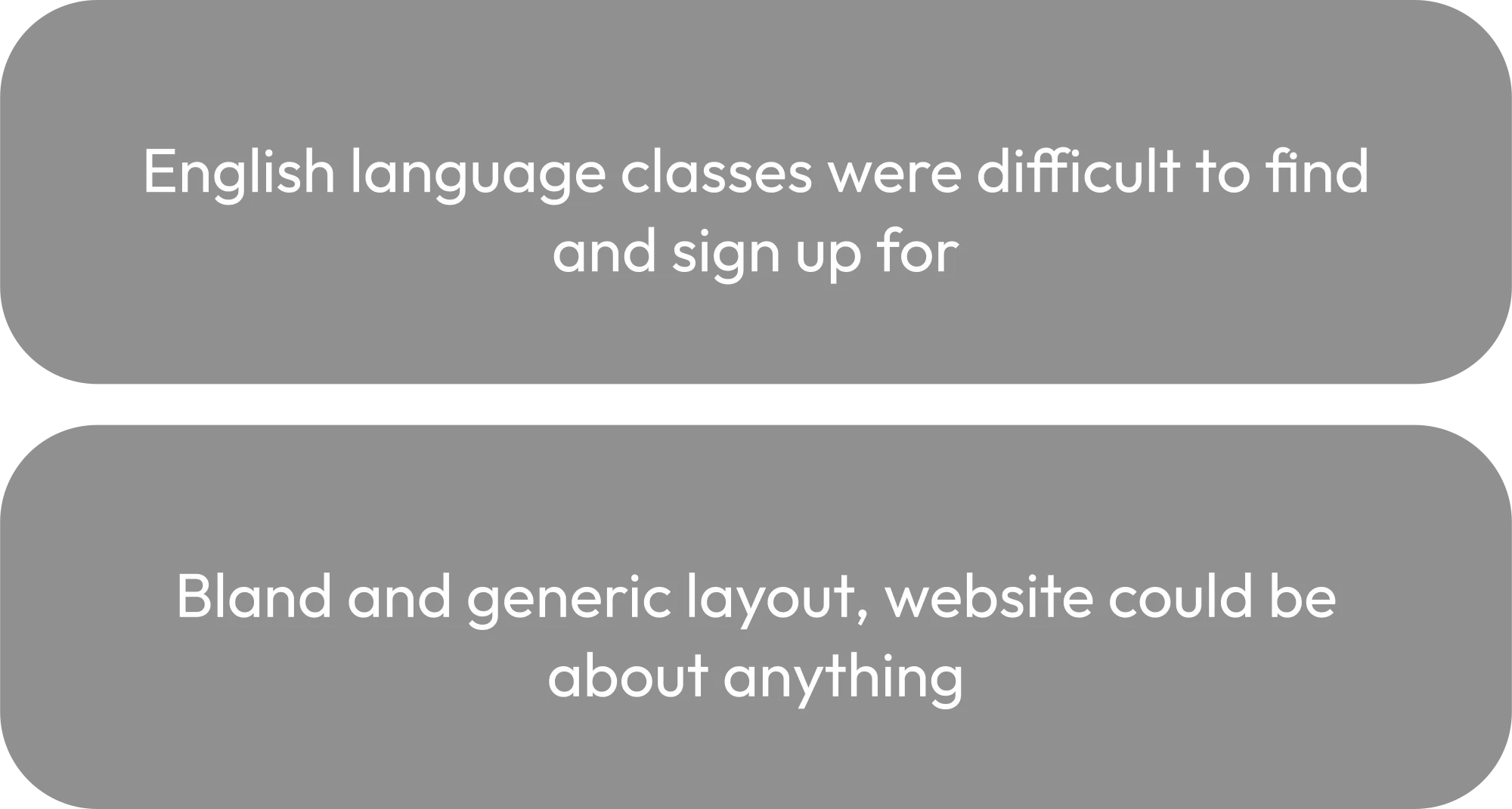
We distributed a survey to people who engage with nonprofit sites or seek community connection, and had users react to the original HCC site through interview questions. Together these sessions gave us the skeleton of what a successful new-user experience needed to feel like.

Research insights

Phase 02

Define

User persona

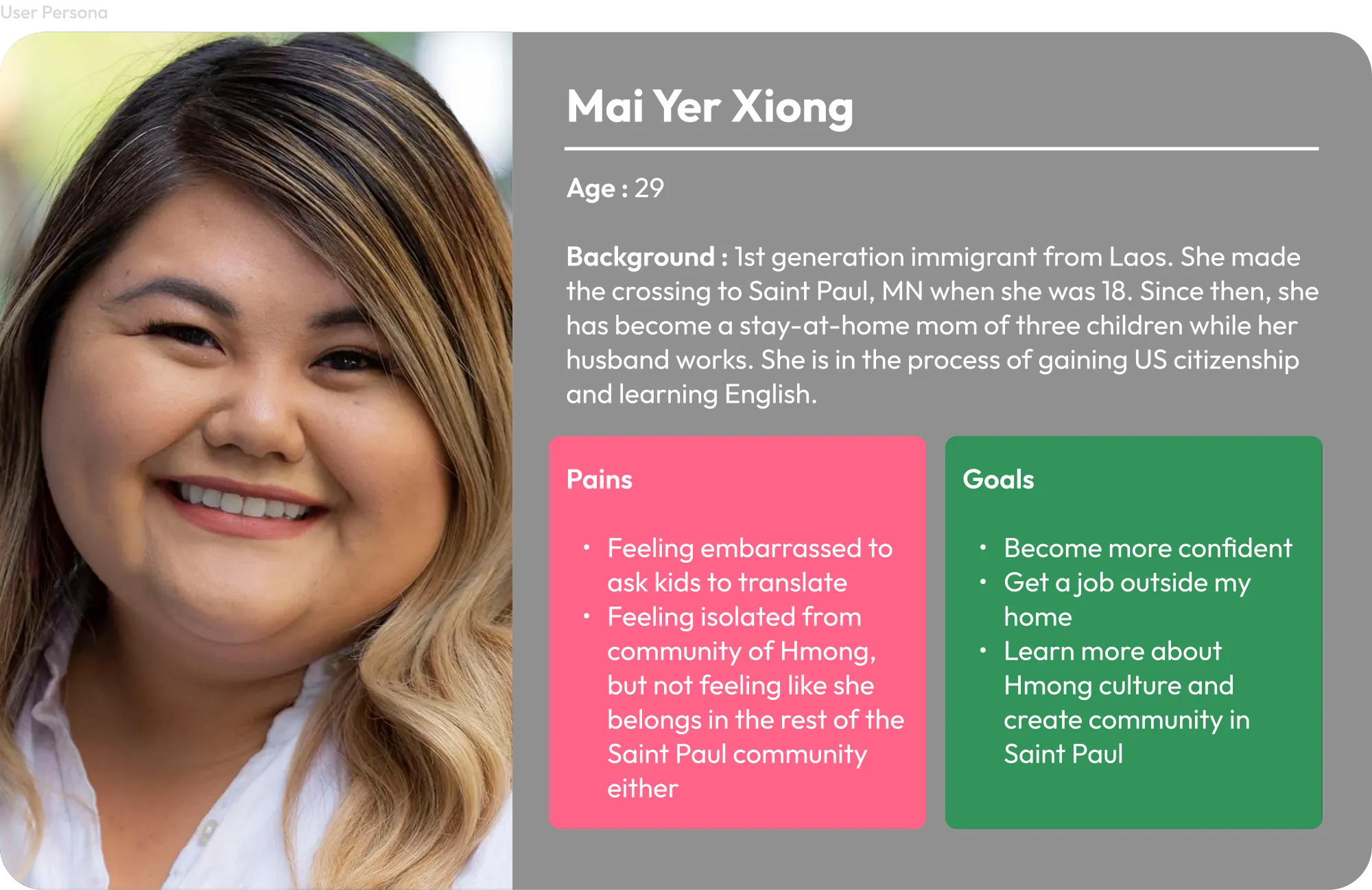
Meet Mai Yer Xiong.

A 29-year-old first-generation immigrant from Laos living in Saint Paul. She has limited English proficiency and a deep desire to connect with her Hmong community while integrating into broader society. Frustrated by dense, text-heavy sites, she often relies on her children to translate, and needs clear pathways to citizenship and English classes.

User persona: Mai Yer Xiong

Empathy map

To serve Mai Yer, the site needs to prominently feature easy-to-find links for citizenship and English classes, showcase community resources, and offer a friendly, low-text interface — with hyperlinks placed to guide her through an intuitive journey toward confidence, jobs, and social connection.

Problem statement

Mai Yer and users like her need a website that's more visually oriented — with prominent iconography, easy access to English-language and citizenship classes, and an overall sense of welcome and community.

Guiding questions

Phase 03

Develop

Information architecture

Information overload.

The old site map was the biggest problem for our users: too much information. Links were redundant or unnecessary, and the most important resources were buried several clicks deep — a frustrating journey, especially for English-language learners.

Site map

User flow

One question, answered fast.

Our guiding user question was simple — "How do I sign up for language classes?" — and we mapped a flow that gets Mai Yer there quickly, with minimal visual noise.

User flow

Paper & mid-fidelity wireframes

Modular design, fast.

I sketched paper prototypes, then moved to mid-fidelity after user testing. On a one-day deadline, I prioritized interaction design and modular patterns to keep the experience consistent, centered, and intuitive despite the rapid turnaround.

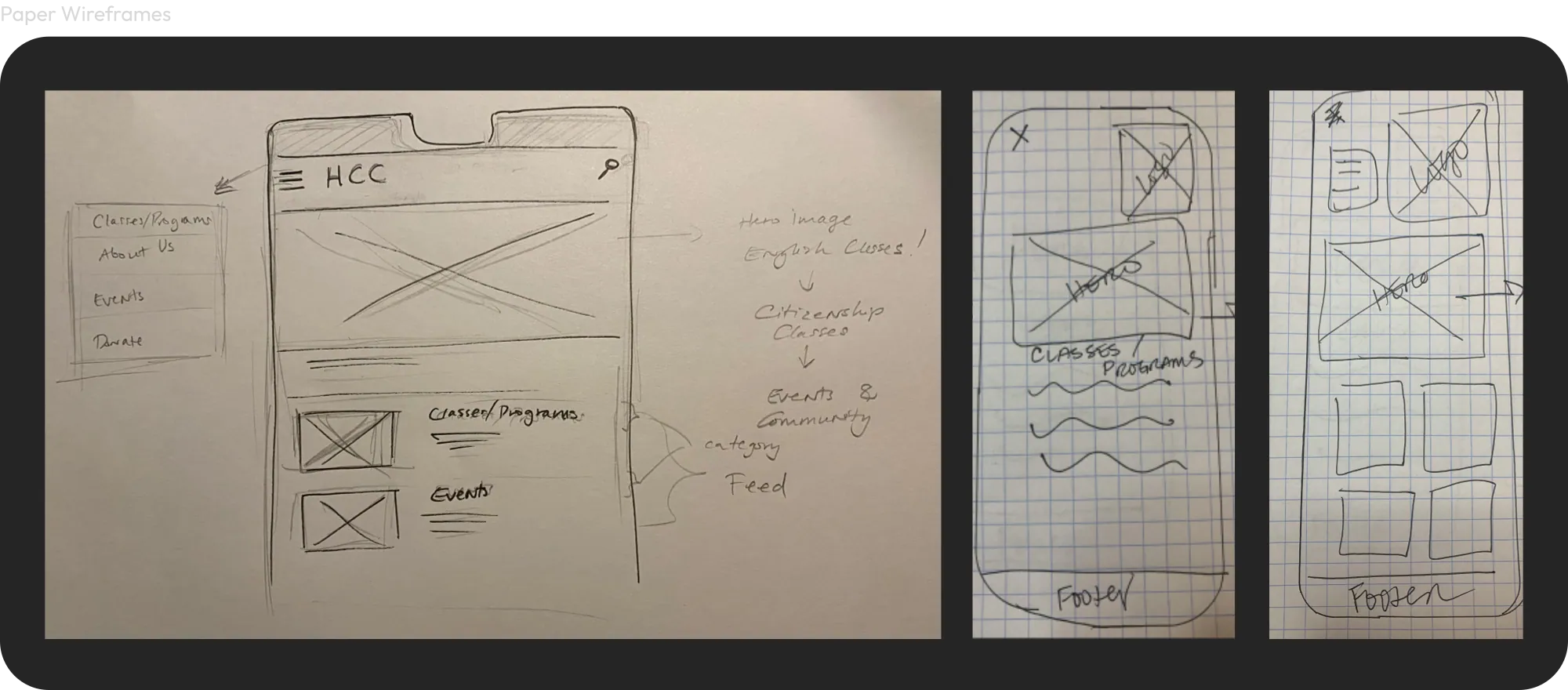
Paper wireframes
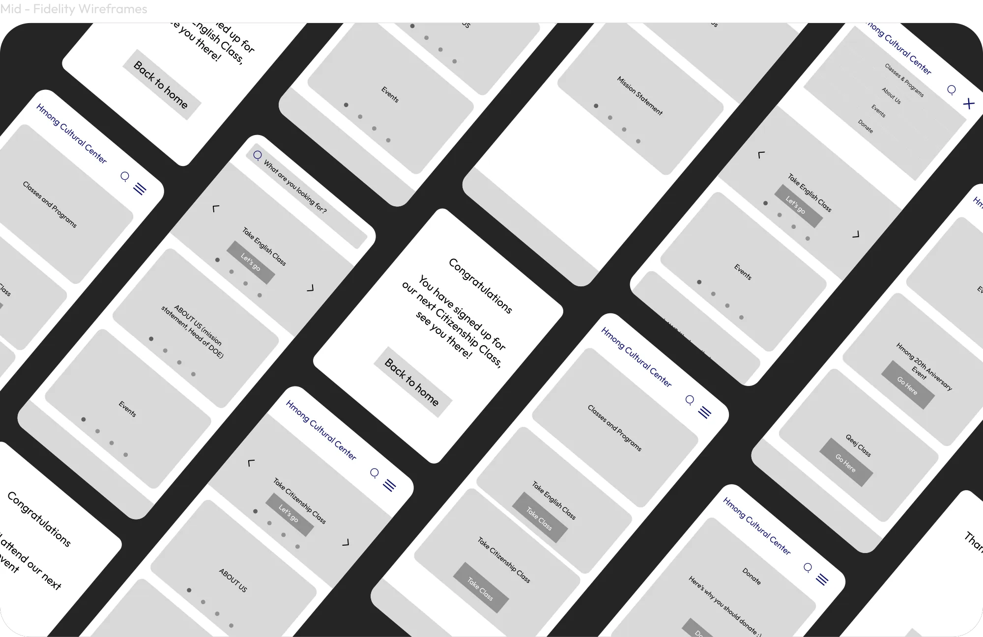
Mid-fidelity wireframes

UI design kit — vibrant clarity

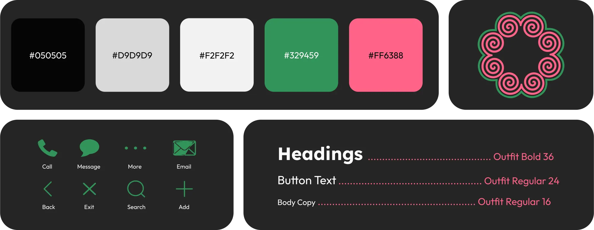
We built a vibrant palette of fluorescent greens, pinks, and blacks for striking contrast, inspired by traditional color schemes. Our logo drew on the elephant's foot — a symbol of community and family — and we chose the Outfit typeface for its clean, uniform, and bold appearance.

UI design kit

Phase 04

Deliver

Mid- to high-fidelity in three days.

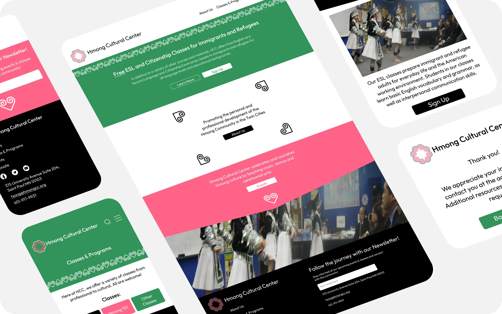
I translated the mid-fidelity mobile wireframes into polished, pixel-perfect mockups for both mobile and desktop — keeping the simplicity of the wireframes while adding the detailed visual elements that bring the center's vision to life.

High-fidelity designs

Feature 01 — ESL & citizenship

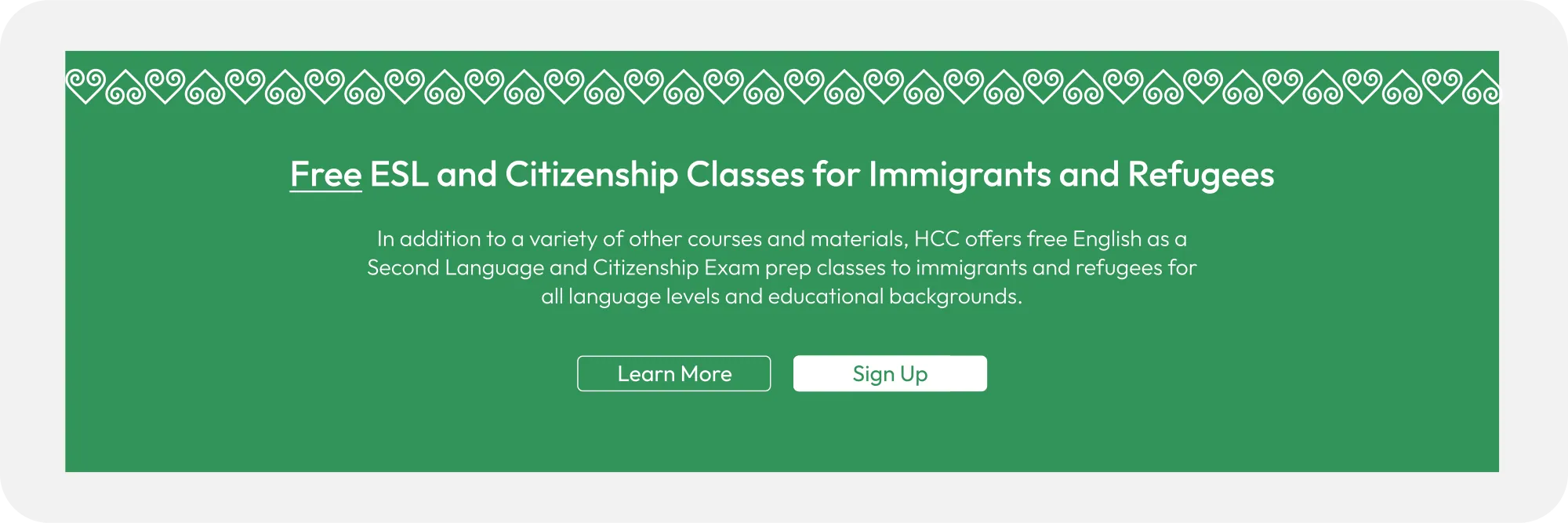
A hero built for signup.

A centralized hero image routes users with limited English proficiency straight to ESL and citizenship signup — eliminating menu navigation and streamlining the whole journey.

Hero for ESL and citizenship programs

Feature 02 — Navigation

Simplified & color-coded.

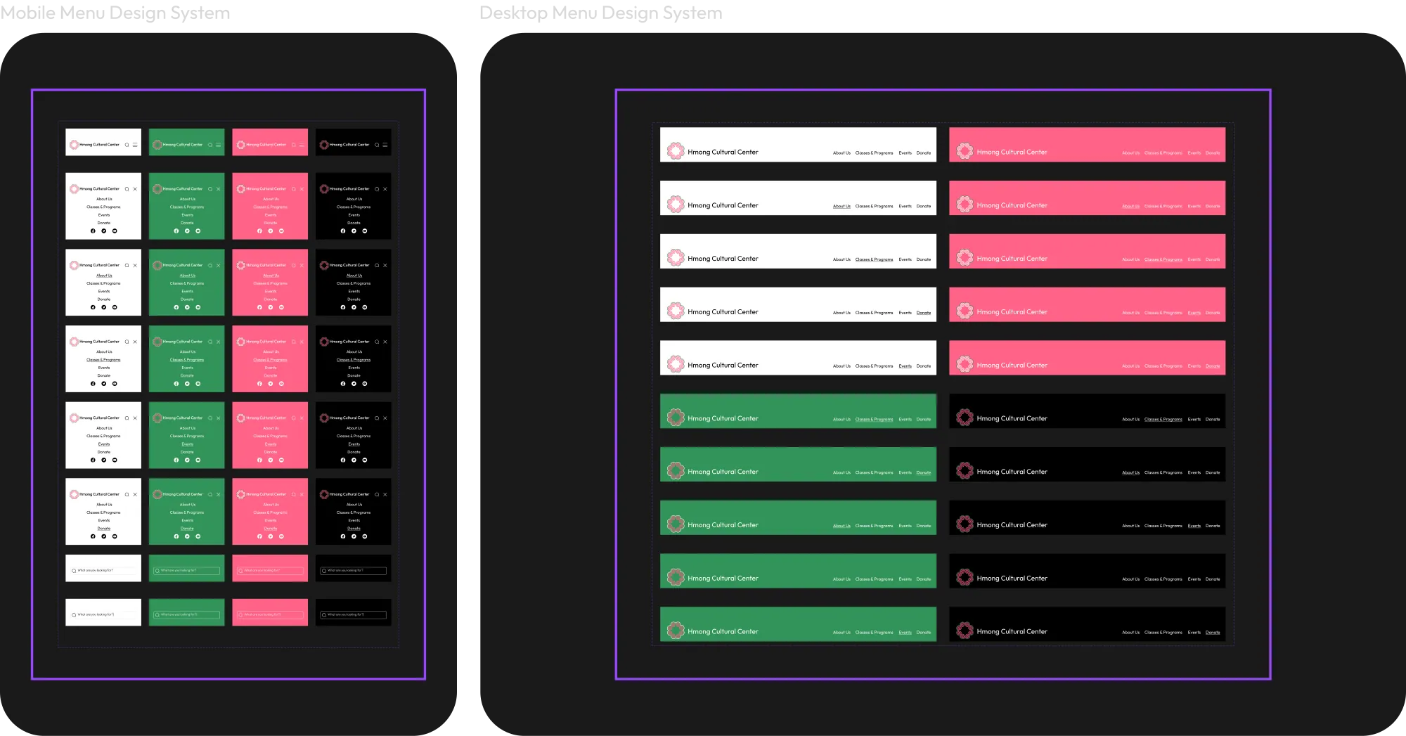
A cohesive menu system for mobile and desktop organizes items intuitively, with a distinct color per page to reinforce the brand. Navigation is central and brightly highlighted, making key sections — especially English classes — far easier to find.

Navigation system

Feature 03 — Branded headers

Focused section banners.

Header banners built from the brand palette and a triangular frame draw focus to each section's content — improving readability and helping users identify where they are.

Branded header banners
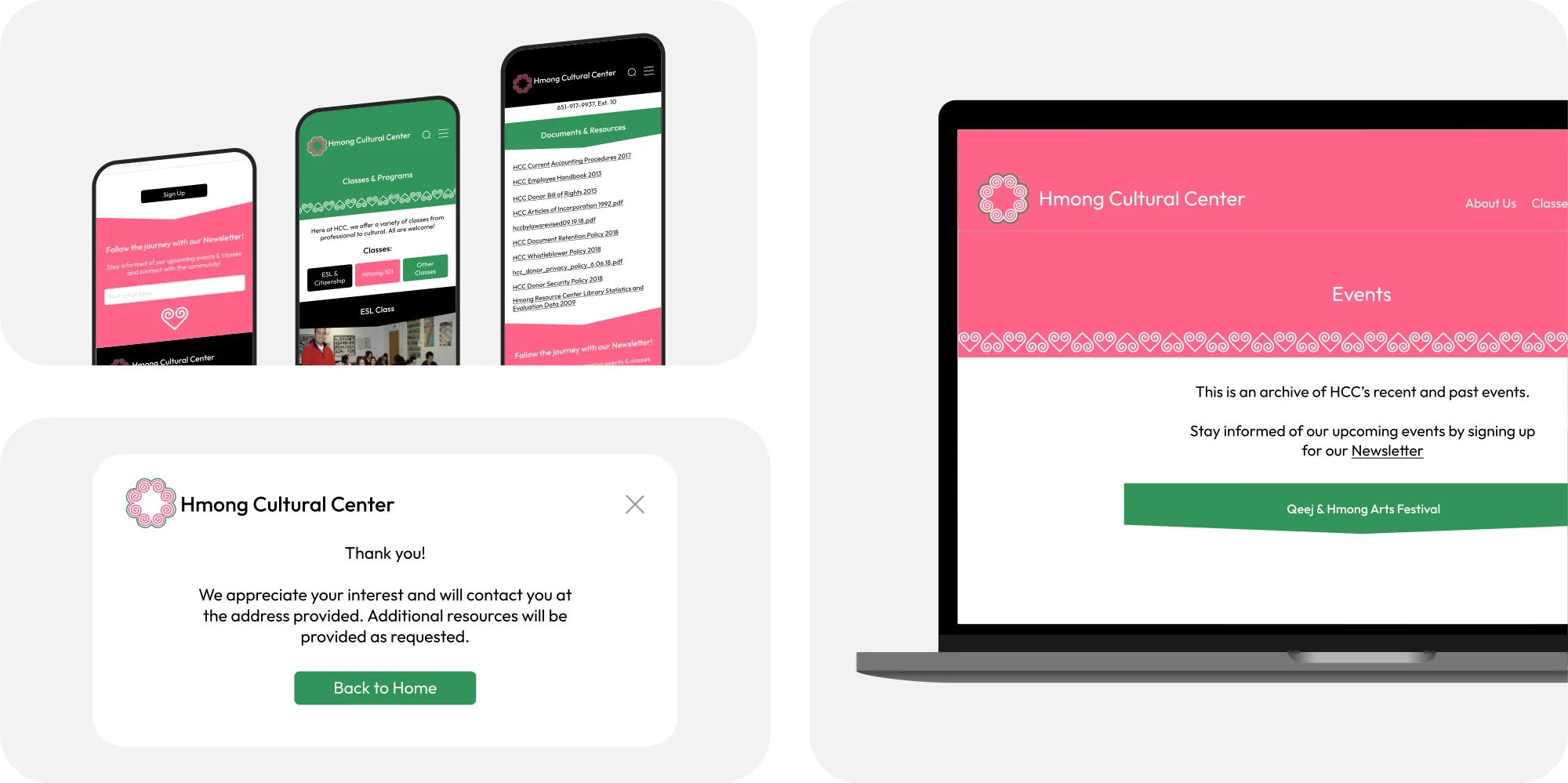
Other screens across mobile and desktop
Consistent branding across every screen, mobile and desktop.

Future developments

The journey continues.

We were thrilled with what we achieved in three weeks — from research to prototyping — but there's more we'd love to build. These are some of the future features and designs I explored for the next chapter.

Future developments
Reflections

Strong design systems = success.

A robust design system — consistent color, typography, and layout — kept the site cohesive and genuinely usable for English-language learners, while weaving Hmong cultural elements into the visual identity and surfacing key offerings like ESL and citizenship classes.

Sprint to success.

Delivering a full redesign in three weeks demanded tight workload management. By prioritizing tasks, setting achievable milestones, and using agile techniques — with lots of collaborative planning — I kept the team aligned and shipped a high-fidelity prototype for both mobile and desktop.

Park n Go
Next case study
Park n Go
All work Product & Marketing Design · B2B SaaS

HelloSpoke

Simplifying enterprise communications through strategic product-marketing design — a redesign of HelloSpoke's digital presence that clearly communicates a complex unified-communications platform, on a scalable marketing website built to support sales, onboarding, and future growth.

HelloSpoke homepage — live site
The live HelloSpoke marketing site.

Role

UX/UI Designer · Web Designer · Product Marketing Designer

Scope

Marketing website, IA, design system, responsive build

Tools

Figma, Divi, WordPress, Illustrator, Photoshop

Timeline

2023 — 2024

Overview

A complex platform that wasn't landing.

HelloSpoke is an AI-powered resident-communication platform that keeps property teams connected — from first call to completed request. The challenge: a broad, technical product whose website didn't clearly communicate its value, with overlapping features that made it hard for prospects to understand what was on offer. They needed a modern marketing site that could support sales and onboarding, and scale as the product line grew.

The Challenge

Turning a technical product into a clear story.

  • Multiple services with overlapping functionality
  • Technical language overwhelming first-time visitors
  • Inconsistent visual hierarchy across pages
  • No clear conversion funnel
  • No scalable system for future product pages
My Objectives

Help visitors understand the product — fast.

Rather than simply redesigning the site, I set clear goals to make a complex platform legible and actionable.

  • Clarify product messaging
  • Simplify information architecture
  • Increase trust and credibility
  • Improve visual hierarchy
  • Support lead generation
  • Create reusable design patterns
  • Build responsive layouts for every page
Discovery

Understanding the business first.

I got up to speed on the communications industry, mapped customer personas, and reviewed competitors to identify where HelloSpoke could differentiate. Working closely with stakeholders, I surfaced the real pain points and the questions every visitor was trying to answer.

Original HelloSpoke site
Reviewing the original site — dense and hard for prospects to parse.
Information Architecture

From a tangle of services to a clear path.

I restructured navigation and page hierarchy so each product had a home and each user journey had a clear route — reducing cognitive load for non-technical buyers.

Core Platform
Assist
Dialtone
Pricing
Resources
About
Sitemap / IA diagram
UX Strategy

Every page answers one question.

I anchored the whole site around the five questions a buyer asks — and made sure each page answered one of them clearly.

  • What does HelloSpoke do?
  • Is this for my business?
  • Why is it different?
  • How much does it cost?
  • How do I get started?
Design System

Consistency that scales.

I built a reusable system — typography, color, buttons, cards, spacing, icons, illustration, and responsive rules — so new product pages could be assembled quickly and stay on-brand.

Navy #16324FBlue #2F7BD0Green #5FBB5ASky #BFE6FBWhite Aa HelloSpoke Clear communication, simply designed. Book a demo See how it works
Design system — color, type, and components, drawn from the HelloSpoke brand.
Brand color systemBrand shapes and illustrationLogo
Key Pages

Homepage

Explain the product in seconds.

A strong value proposition, a clear product overview, trust indicators, and obvious calls to action — so visitors immediately grasp what HelloSpoke does.

Homepage — desktop & mobile

Core Platform

Feature organization led with benefits over features, visual explanations, and a clear hierarchy that makes a broad platform feel simple.

Core Platform page

Assist & Dialtone

Assist communicates automation and AI in terms of user benefit; Dialtone translates a technical product into language non-technical buyers can act on.

Assist & Dialtone pages

Pricing

One of the strongest UX problems — solved with comparison tables, transparency, and decision support that reduces friction on the path to signup.

Pricing page & comparison table

Resources & About

Resources drives educational content, SEO, and lead nurturing; About builds credibility with company story, team, and trust signals.

Resources & About pages
Process & Development

Research to shipped site.

I ran the full workflow — research → wireframes → mid-fidelity → high-fidelity → client feedback → iteration → development → QA — collaborating with the client at each step. The site was built in Divi on WordPress, with responsive implementation, consistent components, and performance in mind.

Low-fidelity wireframes
Low-fidelity wireframes for the redesign.
Brand identity concept
A brand-identity concept exploration.
Outcomes & Reflection

A clearer, scalable presence.

The redesign delivered clearer product messaging, improved navigation, a modern visual identity, and a scalable website architecture that's easier to manage and better supports sales conversations.

Most of all, this project sharpened how I design for enterprise audiences — translating technical language into accessible experiences, building systems that scale, and designing for both marketing and product communication at once.

UX

  • Information architecture
  • User flows
  • Wireframing
  • Responsive design
  • Content strategy

UI

  • Visual design
  • Design systems
  • Typography
  • Component libraries
  • Layout systems

Product

  • Product marketing
  • SaaS UX
  • Enterprise software
  • Feature communication

Development

  • WordPress
  • Divi
  • Responsive build
  • Design QA
Wellness in the Woods
Next case study
Wellness in the Woods
All work Brand & Communications System · Nonprofit

Wellness in the Woods

Building a scalable brand and communications system for a statewide mental-health nonprofit.

Wellness in the Woods serves thousands of Minnesotans through peer support, education, advocacy, virtual programming, fundraising, and community events. As the organization's communications designer, I helped transform an evolving collection of materials into a cohesive brand system that supports staff, volunteers, and community members across every touchpoint.

Wellness in the Woods — live site
The Wellness in the Woods website.

Industry

Mental Health · Nonprofit · Healthcare

Role

Communications Designer

Services

Brand, marketing, social, email, print, content

Timeline

2025 — 2026

The Challenge

Many programs, one brand.

As Wellness in the Woods expanded its programs and statewide reach, communications became increasingly fragmented. Virtual peer support, fundraising campaigns, conferences, podcasts, newsletters, educational programming, and community events all needed to feel like they belonged to one recognizable brand.

The organization needed a design system that balanced professionalism with warmth — ensuring every interaction reflected its recovery-centered values of hope, inclusion, dignity, and support. Those values, documented in the brand standards, became the foundation for everything I created.

The Goal

A cohesive communications ecosystem.

  • Establish visual consistency across every platform
  • Make content production faster for staff
  • Improve accessibility and readability
  • Strengthen recognition of the organization
  • Support fundraising and community engagement
  • Create reusable systems rather than one-off graphics
My Approach

Build a system, not one-offs.

Instead of treating each request as an isolated project, I built an integrated brand system. Every piece — newsletters, presentations, social graphics, event materials — followed shared principles of typography, color, photography, hierarchy, and tone, emphasizing authentic imagery, accessible layouts, and hopeful language aligned with the organization's recovery philosophy.

Deliverables

Across every channel.

Brand

  • Brand guidelines
  • Canva template library
  • Design standards
  • Marketing toolkit

Marketing

  • Social media campaigns
  • Fundraising graphics
  • Event promotion
  • Awareness campaigns

Digital

  • Email newsletters
  • Facebook templates
  • Podcast branding
  • Presentation decks

Print

  • Flyers & posters
  • Signage
  • Conference materials
  • Educational handouts

Community

  • VPSN programming graphics
  • Volunteer materials
  • Member communications
  • Resource guides
Featured Project

Virtual Peer Support Network (VPSN).

One of the largest recurring initiatives involved reusable social-media templates for the Virtual Peer Support Network. Rather than designing each post individually, I developed standardized monthly, weekly, and daily templates that staff could update quickly while keeping a consistent visual identity and messaging structure.

Design System

Warm, accessible, unmistakable.

The system pairs color, typography, iconography, photography, and graphic treatments into a recognizable, recovery-centered look — drawn directly from the organization's brand guide.

Ink #3A3730Gold #B8862FSage #9AA878Tan #C9B892Cream Aa Wellness in the Woods Hope · inclusion · dignity · support. Get Support Donate
A warm, recovery-centered system — cream, gold, and sage with serif display type.
Results

A communications framework, not just materials.

Rather than producing isolated marketing pieces, this project established a communications framework supporting the organization across fundraising, education, peer support, conferences, podcasts, newsletters, and community engagement. The result made future content creation faster, strengthened visual consistency across departments, and helped present Wellness in the Woods as a unified, trustworthy organization.

Gallery
What I Learned

This project reinforced that successful nonprofit branding isn't about making individual graphics look good — it's about building systems that let organizations communicate consistently at scale. By creating reusable templates, clear visual standards, and flexible assets, I helped establish a communications ecosystem that staff can keep using long after any single campaign ends.

Park n Go
Next case study
Needlework Guild of MN
All work Brand Identity · Web · Nonprofit

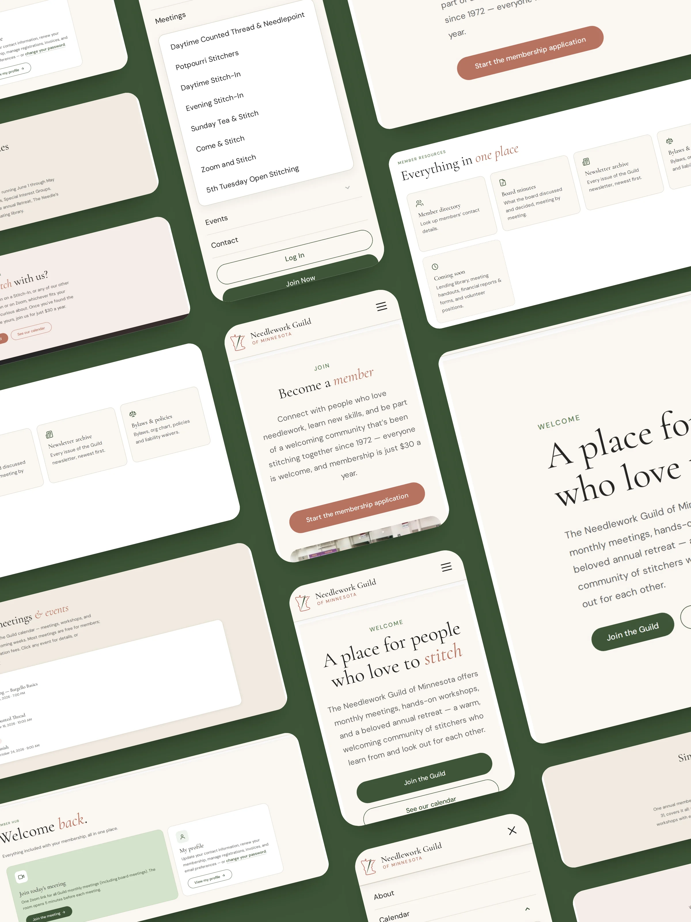
Needlework Guild of Minnesota

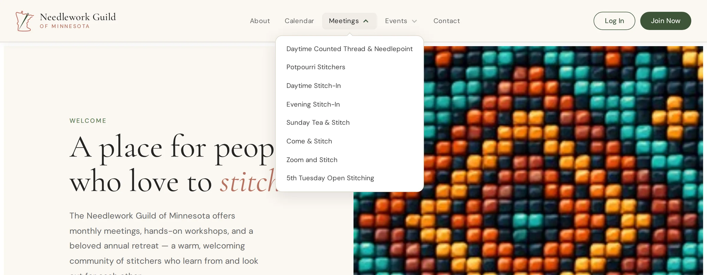
Bringing a longstanding craft community into a welcoming, easy-to-navigate digital home — without losing the heritage that makes it special.

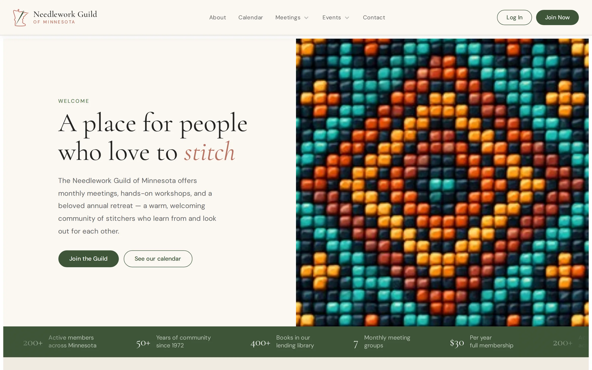
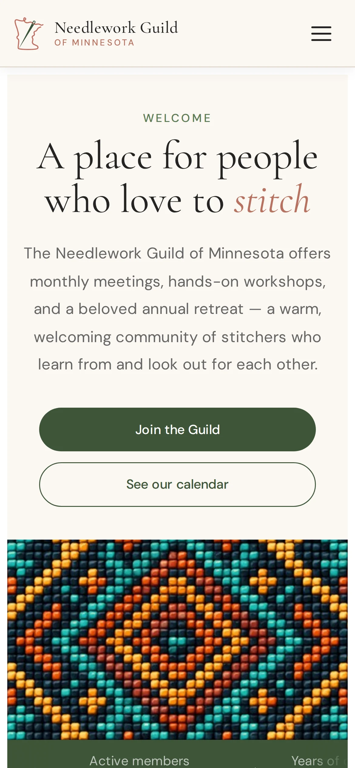
Needlework Guild — redesigned homepage
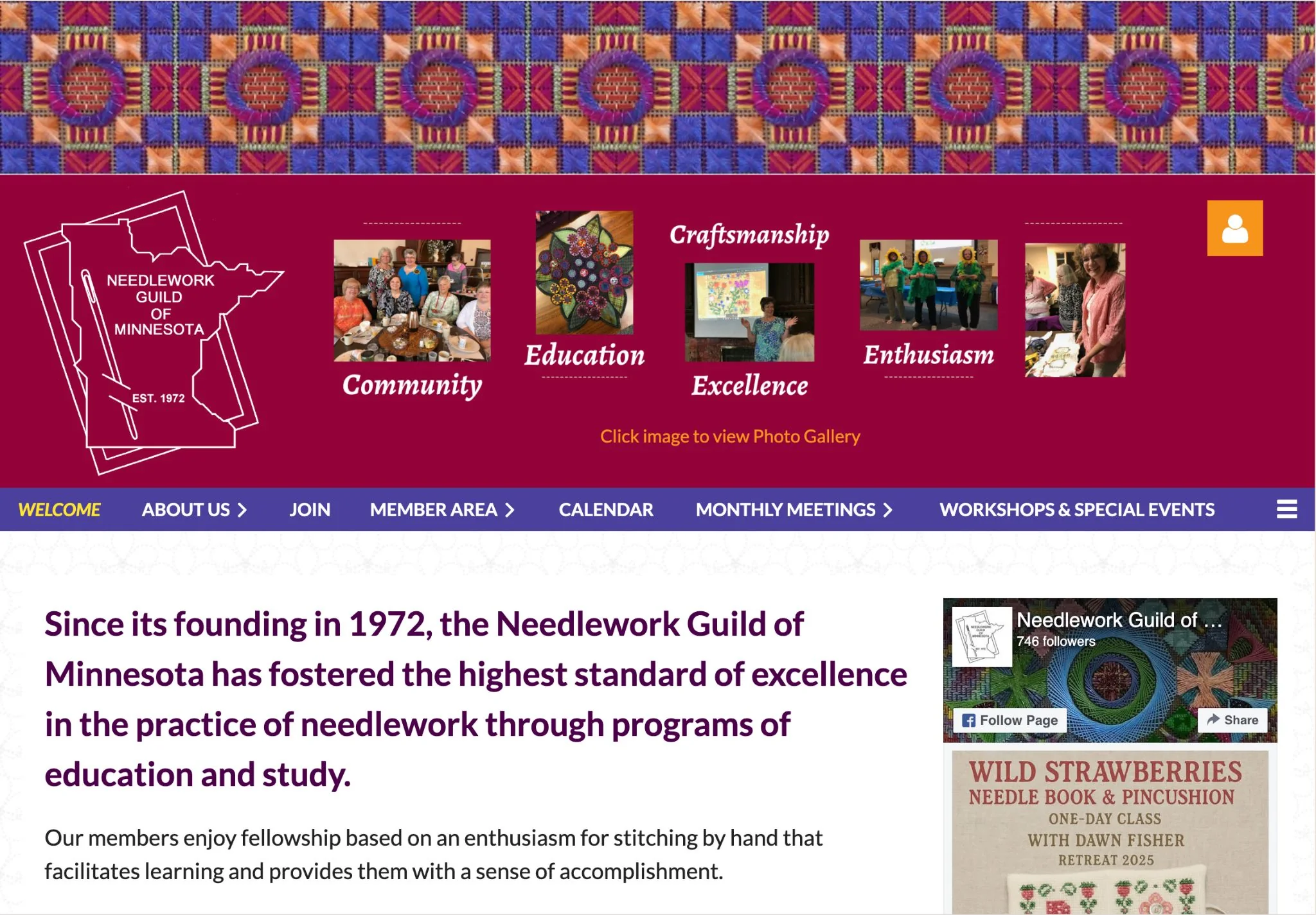
The redesigned Needlework Guild of Minnesota homepage.

Role

Brand & Web Designer

Scope

Identity refresh, website, membership UX

Tools

Figma, Illustrator, Photoshop, Web

Timeline

2024 — 2025

Overview

A craft community with deep roots.

Since 1972, the Needlework Guild of Minnesota has fostered the highest standard of excellence in needlework through education and study — classes, retreats, and a passionate community of members. Its digital presence needed to feel as warm and inviting as the craft itself, and make it easy for new and returning members to find classes, retreats, and how to join.

The Challenge

Heritage that was hard to reach.

The existing site made it difficult to find the things members care about most — classes, retreats, and membership — and the identity didn't reflect the warmth of the craft or invite newcomers in. The Guild needed a refresh that honored its history while lowering the barrier for the next generation of stitchers.

Old Needlework Guild site
The site before the refresh.
The Goal
  • Make classes, retreats, and membership easy to find
  • Create a warmer, more welcoming identity
  • Honor the Guild's 50-year heritage
  • Keep content simple for volunteers to maintain
  • Invite and onboard new members
My Approach

Refresh the identity, restructure the site.

I refreshed the Guild's identity and reorganized the site around what members actually need — joining, learning, and gathering — so the most important pages are the easiest to reach. Warm, traditional colors and classic type honor the craft, while a cleaner structure makes the whole experience feel current and approachable.

Improved information architecture
A restructured information architecture around joining, learning, and gathering.
Design System

Classic, warm, and welcoming.

A heritage-inspired palette of forest, gold, and wine on cream, paired with a classic serif — timeless enough to honor the craft, warm enough to invite newcomers.

Ink #2A2622Wine #7C3B48Forest #2F5D3AGold #C19A3ECream Aa Needlework Guild Excellence in needlework since 1972. Join us Browse classes
A heritage-inspired system built to feel warm and welcoming.
Needlework Guild brand hero
LogoBrand patternBrand marks
Key Areas

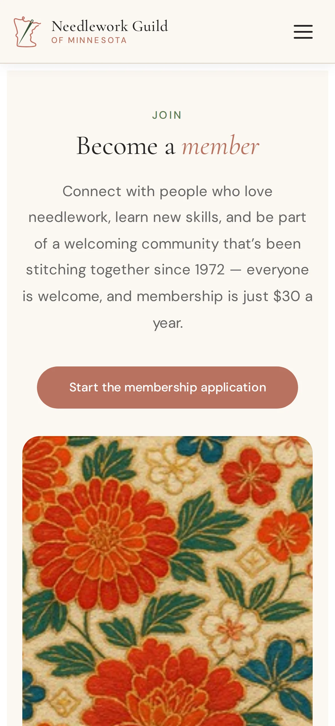
Membership & joining

A clear path to become a member, with the value of the Guild front and center for newcomers.

Classes & retreats

Programs, classes, and the Guild's signature retreats surfaced and easy to browse and register for.

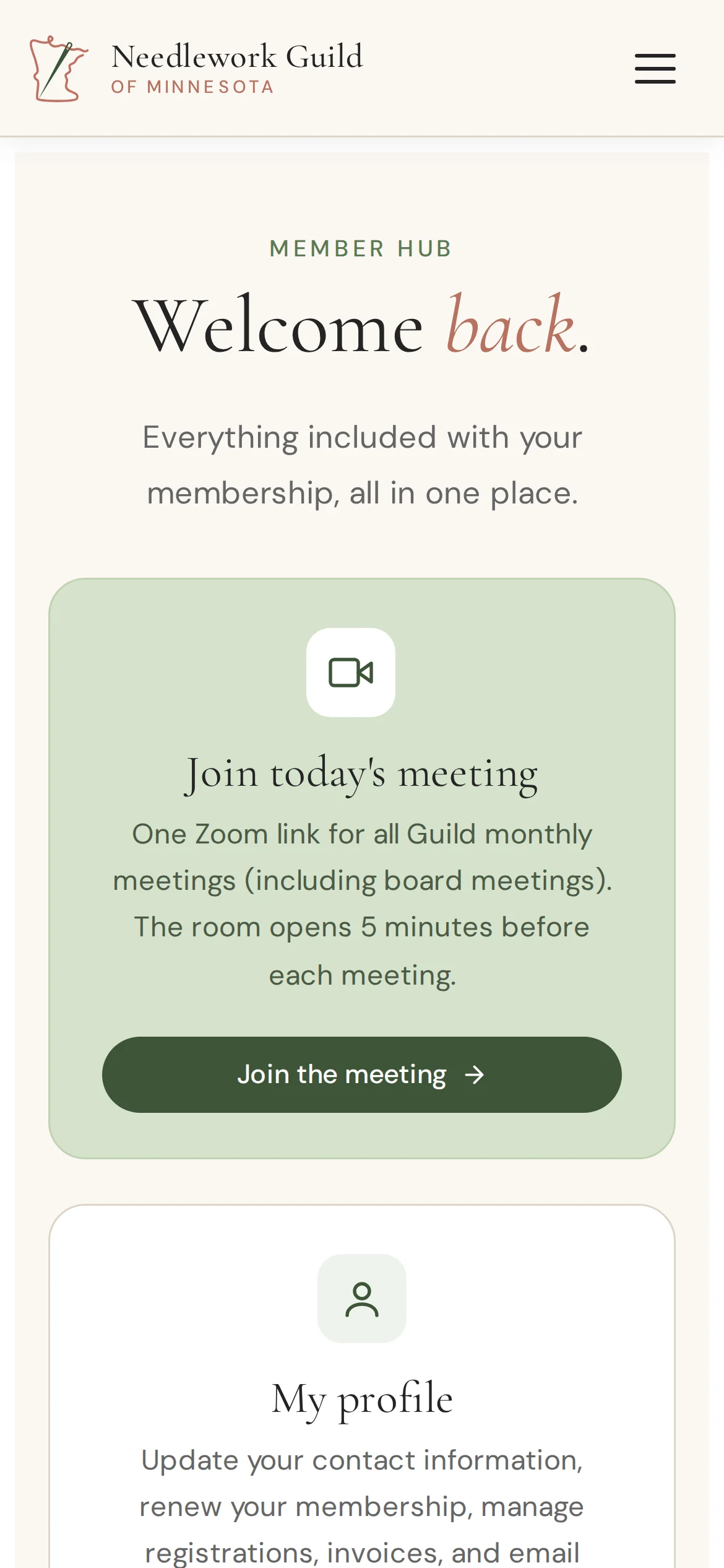
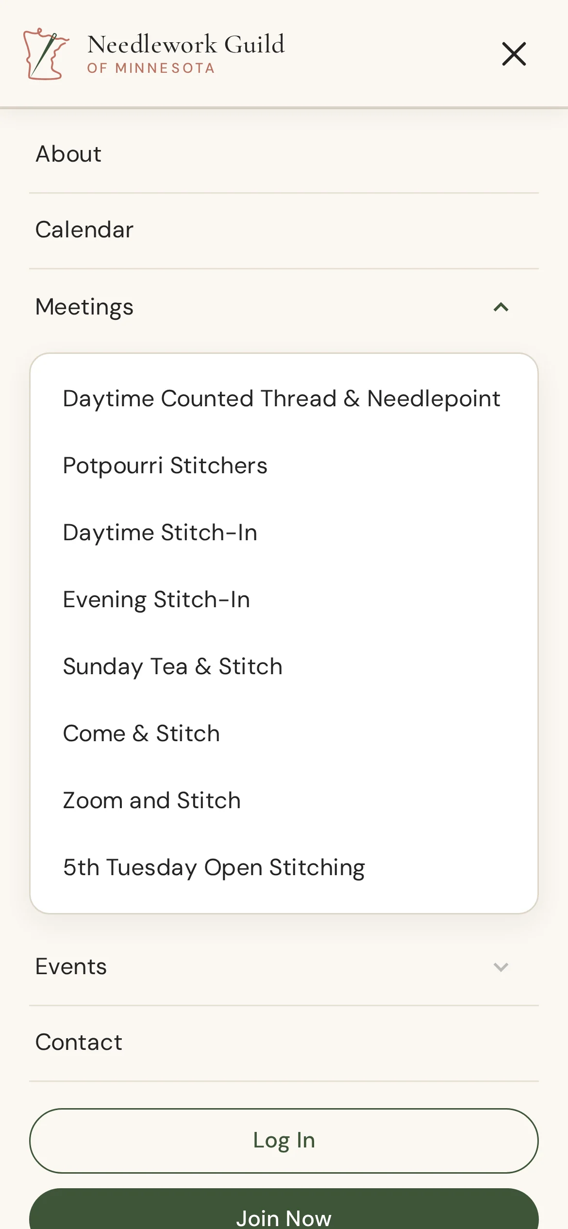
Meetings page
The redesigned meetings page.
Events page
Events, made easy to browse.
Results & Reflection

A warmer front door.

The refresh gave the Guild a clearer, friendlier presence — easier navigation to classes, retreats, and membership, and an identity that honors a 50-year legacy while opening the door to new members.

Designing for a heritage community reinforced how to honor the past while lowering the barrier for newcomers — small, respectful changes that make a longstanding organization feel current and welcoming.

Park n Go
Next case study
Park n Go